Symbianize Forum
Most of our features and services are available only to members, so we encourage you to login or register a new account. Registration is free, fast and simple. You only need to provide a valid email. Being a member you'll gain access to all member forums and features, post a message to ask question or provide answer, and share or find resources related to mobile phones, tablets, computers, game consoles, and multimedia.
All that and more, so what are you waiting for, click the register button and join us now! Ito ang website na ginawa ng pinoy para sa pinoy!
You are using an out of date browser. It may not display this or other websites correctly.
You should upgrade or use an alternative browser.
You should upgrade or use an alternative browser.
C&C your graphic works
- Thread starter Masaya
- Start date
- Replies 5,163
- Views 348,186
More options
Who Replied?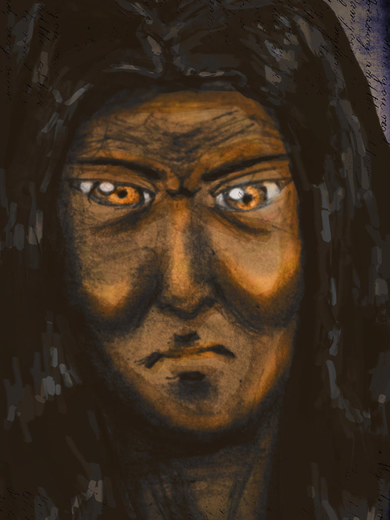
- Messages
- 453
- Reaction score
- 2
- Points
- 28
- Messages
- 722
- Reaction score
- 2
- Points
- 128
- Messages
- 29,544
- Reaction score
- 16,949
- Points
- 2,228
Re: C&C your graphic works
nice! gusto ko yung color theme... blue/blue-green/green.
type ko yung nasa lower-right na design. pati na rin yung babae sa pictures. jk
jk
honestly, mahirap mag-critique ng isang digital painting since kalayaan na ng artist yan on how he/she executes his/her art. kumbaga, kanya-kanyang style yan. walang tama at wala ding mali.
pero your art is nice ah. keep it up!
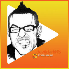
ito ang madaling i-critique... since photomanipulation. hehe.
ayos naman yung execution mo. gusto ko yung effect na ginawa mo para ma-isolate or ma-highlight si Cyrus.
pero yung texts mo – yung logo ng Alaska, the quote below it, yung username mo tsaka yung pangalan ni Cyrus sa baba, nakakalat.
sa ganitong klaseng artwork kung saan meron kang hina-highlight na tao, mas maayos tignan if you keep your texts to a minimum since ang highlight naman talaga nung artwork mo eh si Cyrus Baguio. kapag kalat kasi ang texts mo, masyadong nakaka-distract para sa aming mga tumitingin. kumbaga, less is more effective.
also, try to use the "Rule of Thirds"...
basically, photography guideline siya on how to make the viewers "focus" on the photo's subject. pwede mo ring i-capitalize yan para yung ibang details ng image mo eh mailagay mo sa "focus". kahit na it's more on photography, applicable din yan sa art in general, lalo na sa mga artwork na nagfi-feature ng isang focal/subject... katulad ng sayo.
ayos na yung pwesto ni Cyrus, pero yung texts mo, yun talaga yung parang nakasira eh. kaya as i said, try to minimize it at i-gitna mo rin sila kahit papano. wag mong ilalagay sa lower-right, lower-left, upper-left, o kung saan pa man kasi maaalis sa focal mo (Cyrus) yung focus ng mga titingin. so ilagay mo siya mostly sa gitna or katabi ng focal mo para hindi masisira yung focus ng mga titingin.
may napansin din akong mga minor things, katulad ng quality ng Alaska logo mo. blurred siya kaya halata na low-quality image siya. mahalaga kasi sa photomanipulation ang gumamit ng mga high-quality na images/resources kasi nakakasira din yan ng overall "look" ng artwork mo kung gagamit ka ng mga low-quality images as your resources. pixelated kasi sila, may noise, or worse, blurred since mababa lang ang quality. pero if you're skilled enough, kaya namang gawan ng paraan yan. sabi nga nung kaklase ko dati nung college na tinandaan ko talaga hanggang ngayon, "kung wala kang mahanap na resources, gumawa ka." yung Alaska logo, kaya mong kopyahin/gumawa nyan via pen tool kung marunong ka rin sa vector art.
 ")
tsaka yung ibang body parts ni Cyrus, na-blur, lalo na yung edges ng binti, shorts, tsaka bicep/braso niya. parang nakasira kasi siya sa focal mo, para sakin.
yun lang. keep practicing bro!
View attachment 1027295
View attachment 1027296
critics are welcome and please suggest any idea or revision for my company ID design and please kindly choose a version layout you like. this design will be print soon after the meeting this weekend so i need your friendly advice.
i'm a lighting designer not a graphic designer ^_^ . i use adobe Illustrator color is set to CMYK for ready print.
thanks
- roy ^_^ (former member of symb since 2010) "noveycizsnei2010"
nice! gusto ko yung color theme...
blue/blue-green/green.type ko yung nasa lower-right na design. pati na rin yung babae sa pictures.
jkhttp://i.imgur.com/Al45HQk.jpg?1
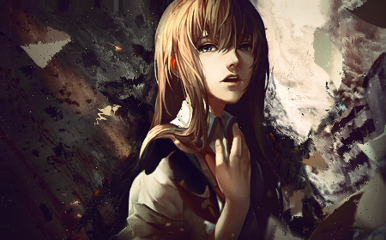
Digital Painting, "Datu Hirayamanawari" still stuying, shadow, light and color manipulation
honestly, mahirap mag-critique ng isang digital painting since kalayaan na ng artist yan on how he/she executes his/her art. kumbaga, kanya-kanyang style yan. walang tama at wala ding mali.
pero your art is nice ah. keep it up!
ako din baguhan lang po sa photoshop... paki husgahan naman po gawa ko mga photoshop experts dito para maimprove ko pa ang gawa ko... salamat po!
ito ang madaling i-critique... since photomanipulation. hehe.
ayos naman yung execution mo. gusto ko yung effect na ginawa mo para ma-isolate or ma-highlight si Cyrus.
pero yung texts mo – yung logo ng Alaska, the quote below it, yung username mo tsaka yung pangalan ni Cyrus sa baba, nakakalat.
sa ganitong klaseng artwork kung saan meron kang hina-highlight na tao, mas maayos tignan if you keep your texts to a minimum since ang highlight naman talaga nung artwork mo eh si Cyrus Baguio. kapag kalat kasi ang texts mo, masyadong nakaka-distract para sa aming mga tumitingin. kumbaga, less is more effective.
also, try to use the "Rule of Thirds"...
basically, photography guideline siya on how to make the viewers "focus" on the photo's subject. pwede mo ring i-capitalize yan para yung ibang details ng image mo eh mailagay mo sa "focus". kahit na it's more on photography, applicable din yan sa art in general, lalo na sa mga artwork na nagfi-feature ng isang focal/subject... katulad ng sayo.
ayos na yung pwesto ni Cyrus, pero yung texts mo, yun talaga yung parang nakasira eh. kaya as i said, try to minimize it at i-gitna mo rin sila kahit papano. wag mong ilalagay sa lower-right, lower-left, upper-left, o kung saan pa man kasi maaalis sa focal mo (Cyrus) yung focus ng mga titingin. so ilagay mo siya mostly sa gitna or katabi ng focal mo para hindi masisira yung focus ng mga titingin.
may napansin din akong mga minor things, katulad ng quality ng Alaska logo mo. blurred siya kaya halata na low-quality image siya. mahalaga kasi sa photomanipulation ang gumamit ng mga high-quality na images/resources kasi nakakasira din yan ng overall "look" ng artwork mo kung gagamit ka ng mga low-quality images as your resources. pixelated kasi sila, may noise, or worse, blurred since mababa lang ang quality. pero if you're skilled enough, kaya namang gawan ng paraan yan. sabi nga nung kaklase ko dati nung college na tinandaan ko talaga hanggang ngayon, "kung wala kang mahanap na resources, gumawa ka."
yung Alaska logo, kaya mong kopyahin/gumawa nyan via pen tool kung marunong ka rin sa vector art. tsaka yung ibang body parts ni Cyrus, na-blur, lalo na yung edges ng binti, shorts, tsaka bicep/braso niya. parang nakasira kasi siya sa focal mo, para sakin.
yun lang. keep practicing bro!
Last edited by a moderator:
- Messages
- 20
- Reaction score
- 0
- Points
- 26
Re: C&C your graphic works
Merun kayong ganitong fonrt
yuppytc-regular
helvetica
thanks?
Merun kayong ganitong fonrt
yuppytc-regular
helvetica
thanks?
- Messages
- 29,544
- Reaction score
- 16,949
- Points
- 2,228
Re: C&C your graphic works
^
try looking at the Graphic Resources section.
this thread is purely for C&C sir.
^
try looking at the Graphic Resources section.
this thread is purely for C&C sir.
Re: C&C your graphic works
haha yun ang gusto ko eh pag nag critics pati chicks kasama
thank you sir ^_^ marami din nagsabi prefered nila yung sa lower-right, salamat
- - - Updated - - -
Admin wag po delete tong post alam kong off-topic to pero kasi restricted ang uploading sa office so temporary delete din ito after i post a notice.
Thank you for understanding.
Regards,
Roy.
nice! gusto ko yung color theme...
type ko yung nasa lower-right na design. pati na rin yung babae sa pictures.
haha yun ang gusto ko eh pag nag critics pati chicks kasama
thank you sir ^_^ marami din nagsabi prefered nila yung sa lower-right, salamat
- - - Updated - - -
Admin wag po delete tong post alam kong off-topic to pero kasi restricted ang uploading sa office so temporary delete din ito after i post a notice.
Thank you for understanding.
Regards,
Roy.
Attachments
Re: C&C your graphic works
View attachment 220701
new post of my current study.
Post Processing only is the vignette. all RAW.
Material setup is a bit of glow, diffuse and a little reflectance using HDRI as my primiary light, camera is at default.
View attachment 220701
new post of my current study.
Post Processing only is the vignette. all RAW.
Material setup is a bit of glow, diffuse and a little reflectance using HDRI as my primiary light, camera is at default.
Attachments
- Messages
- 723
- Reaction score
- 2
- Points
- 28

Re: C&C your graphic works
ang galing neto wala akong masabi
http://i.imgur.com/Al45HQk.jpg?1
Digital Painting, "Datu Hirayamanawari" still stuying, shadow, light and color manipulation
ang galing neto
wala akong masabi- Messages
- 3,993
- Reaction score
- 4
- Points
- 128
Re: C&C your graphic works
 napaka galing mo talaga sir...
Pa cnc po, napag tripan lang kanina hehe",
http://i.imgur.com/JA2wc7a.gif
napaka galing mo talaga sir... - Messages
- 35
- Reaction score
- 0
- Points
- 26
good this is good
- Messages
- 156
- Reaction score
- 0
- Points
- 26
pa CnC po
I used stock wallpapers and ripple on this work
View attachment 235746
http://kimochimochi.deviantart.com <-- DA account ko ^_^ feel free to browse sa iba kong mga gawa
I used stock wallpapers and ripple on this work
View attachment 235746
http://kimochimochi.deviantart.com <-- DA account ko ^_^ feel free to browse sa iba kong mga gawa
Attachments
Last edited:
- Messages
- 354
- Reaction score
- 1
- Points
- 128
http://www.symbianize.com/attachment.php?attachmentid=1062467&stc=1&d=1442558026
pa CC mga dre salamat!
about this artwork bro devil, wala ako masabi kasi flatten na sya
 siguro more improve text/typo and add more details
 kiu!
pa CnC po
I used stock wallpapers and ripple on this work
View attachment 1068787
http://kimochimochi.deviantart.com <-- DA account ko ^_^ feel free to browse sa iba kong mga gawa
nice experiment sir, nice depth, mejo grunge ang dating neto.
siguro make a flow para swabe tingnan nice done sir.

- Messages
- 530
- Reaction score
- 0
- Points
- 126
Technically ok naman sya.. Blending ng resources, light source , concept ok naman sya. Siguro konting depth pa para mas maemphasize yun gurl (pwede mo din sya palakihan ng konti)
Siguro sa tingin ko ang kulang lng nito ay yun WOW factor na which is mas lalong ngpapa angat ng concept.. Lalo pat surrealism ang theme
Kiu
Siguro sa tingin ko ang kulang lng nito ay yun WOW factor na which is mas lalong ngpapa angat ng concept.. Lalo pat surrealism ang theme
Kiu
- Messages
- 12,523
- Reaction score
- 58,636
- Points
- 1,503
Technically ok naman sya.. Blending ng resources, light source , concept ok naman sya. Siguro konting depth pa para mas maemphasize yun gurl (pwede mo din sya palakihan ng konti)
Siguro sa tingin ko ang kulang lng nito ay yun WOW factor na which is mas lalong ngpapa angat ng concept.. Lalo pat surrealism ang theme
Kiu
 po bossing sa laging pag CC. Konting praktis pa
- Messages
- 157
- Reaction score
- 0
- Points
- 26
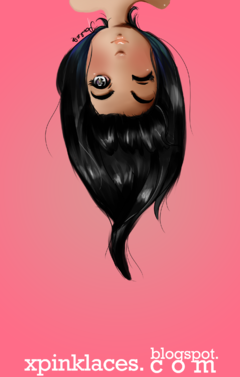
Yey. Share ko lang 'to dapat portrait ko 'to
kaso hindi ko yata kamukha HAHAHA Thank you.
Program used : Paint tool SAI & Ps5 (Bg & text)

View attachment 240247
Hq : Cliiiiiick
kaso hindi ko yata kamukha HAHAHA Thank you.
Program used : Paint tool SAI & Ps5 (Bg & text)
View attachment 240247
Hq : Cliiiiiick
Attachments
Last edited:
- Messages
- 530
- Reaction score
- 0
- Points
- 126
Yey. Share ko lang 'to dapat portrait ko 'to
kaso hindi ko yata kamukha HAHAHA Thank you.
Program used : Paint tool SAI & Ps5 (Bg & text)
View attachment 1075513
Hq : Cliiiiiick
Astig
Kuhang kuha ang details swabeng swabe lang
Tanong lang po mam gumagamit po ba kayo ng pentab or mouse lang?
- Messages
- 157
- Reaction score
- 0
- Points
- 26
Astig
Kuhang kuha ang details swabeng swabe lang
Tanong lang po mam gumagamit po ba kayo ng pentab or mouse lang?
Pentab days na to e
Pero may mga gawa din akong mouse lang po. Minsan post ko. Thank youu