- Messages
- 48
- Reaction score
- 0
- Points
- 26
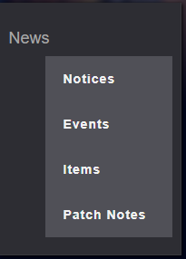
View attachment 320271
<div class ="container">
<div id ="contents">
<aside>
<h1>News</h1>
<ul>
<li><a href="/news/notice">Notices</a></li>
<li><a href="/news/event">Events</a></li>
<li><a href="/news/item">Items</a></li>
<li><a href="/news/patchnote">Patch Notes</a></li>
</ul>
</aside>
</div>
</div>
//CSS
#contents aside{
margin-top: 10px;
float: left;
width: 200px;
padding: 10px 9px 9px 10px;
border-right: 1px solid #39393d;
border-bottom: 1px solid #39393d;
background-color: #2d2d33;
text-align: left;
box-shadow: 1px 1px 5px #000;
}
#contents aside h1 {
padding: 20px 0 20px 5px;
font-size: 18px;
color: #a6a6a6;
}
#contents aside ul li a{
display: block;
width: 100%;
height: 50px;
background: #505057 url('Images/arrow.png') 177px 20px no-repeat;
line-height: 50px;
font-weight: bold;
font-size: 14px;
color: #f2f2f2;
letter-spacing: 1px;
text-indent: 20px;
}
#contents aside ul li.active a{
background-color: #ffa613;
color: #fff;
text-decoration: none;
}
#contents aside ul li > a:hover{
display: block;
background: url('Images/arrow.png') 177px 20px no-repeat;
color: #fff;
text-decoration: none;
}
#contents aside h1{
padding: 0;
}
Mga sir, paano gawin ganito yang nasa picture sa taas? yan nadin yung codes ko salamat!
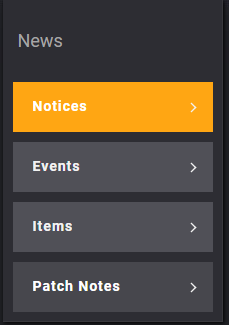
View attachment 320272
<div class ="container">
<div id ="contents">
<aside>
<h1>News</h1>
<ul>
<li><a href="/news/notice">Notices</a></li>
<li><a href="/news/event">Events</a></li>
<li><a href="/news/item">Items</a></li>
<li><a href="/news/patchnote">Patch Notes</a></li>
</ul>
</aside>
</div>
</div>
//CSS
#contents aside{
margin-top: 10px;
float: left;
width: 200px;
padding: 10px 9px 9px 10px;
border-right: 1px solid #39393d;
border-bottom: 1px solid #39393d;
background-color: #2d2d33;
text-align: left;
box-shadow: 1px 1px 5px #000;
}
#contents aside h1 {
padding: 20px 0 20px 5px;
font-size: 18px;
color: #a6a6a6;
}
#contents aside ul li a{
display: block;
width: 100%;
height: 50px;
background: #505057 url('Images/arrow.png') 177px 20px no-repeat;
line-height: 50px;
font-weight: bold;
font-size: 14px;
color: #f2f2f2;
letter-spacing: 1px;
text-indent: 20px;
}
#contents aside ul li.active a{
background-color: #ffa613;
color: #fff;
text-decoration: none;
}
#contents aside ul li > a:hover{
display: block;
background: url('Images/arrow.png') 177px 20px no-repeat;
color: #fff;
text-decoration: none;
}
#contents aside h1{
padding: 0;
}
Mga sir, paano gawin ganito yang nasa picture sa taas? yan nadin yung codes ko salamat!
View attachment 320272
")