- Messages
- 2,898
- Reaction score
- 1
- Points
- 28
- Thread Starter
- #261
Wow. Patambay dito mga sir.
Cge lang po tambay lang po kayu

Gusto ko rin ito! Pa bookmark TS!
hehe chalamat po

Most of our features and services are available only to members, so we encourage you to login or register a new account. Registration is free, fast and simple. You only need to provide a valid email. Being a member you'll gain access to all member forums and features, post a message to ask question or provide answer, and share or find resources related to mobile phones, tablets, computers, game consoles, and multimedia.
All that and more, so what are you waiting for, click the register button and join us now! Ito ang website na ginawa ng pinoy para sa pinoy!
Wow. Patambay dito mga sir.
Gusto ko rin ito! Pa bookmark TS!
Wow nice tutorial sir hahah MEDyo bc pa kasi ako for our group project sensya na matatgalan pa ata bago ako mag update kaya kaw muna bahal if ok lang sir
")


cgeh sir...no problem..hehe
Compile lng ulit aq ng tutorials,later q n po isha2re mga sir...
happy editing...!
thanks po nang marami mga master... keep on sharing..


bookmark muna sir. ito gusto ko mapag aralan.
Eto nga pala yung bago kong pinag aaralan.. kasu nahihirpan pa ko


ETO PA DAGDAGAN ULIT NATIN NG ISA PANG TUTORIAL
THIS TIME NEXT LEVEL NA TYO
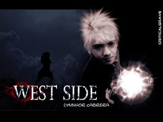
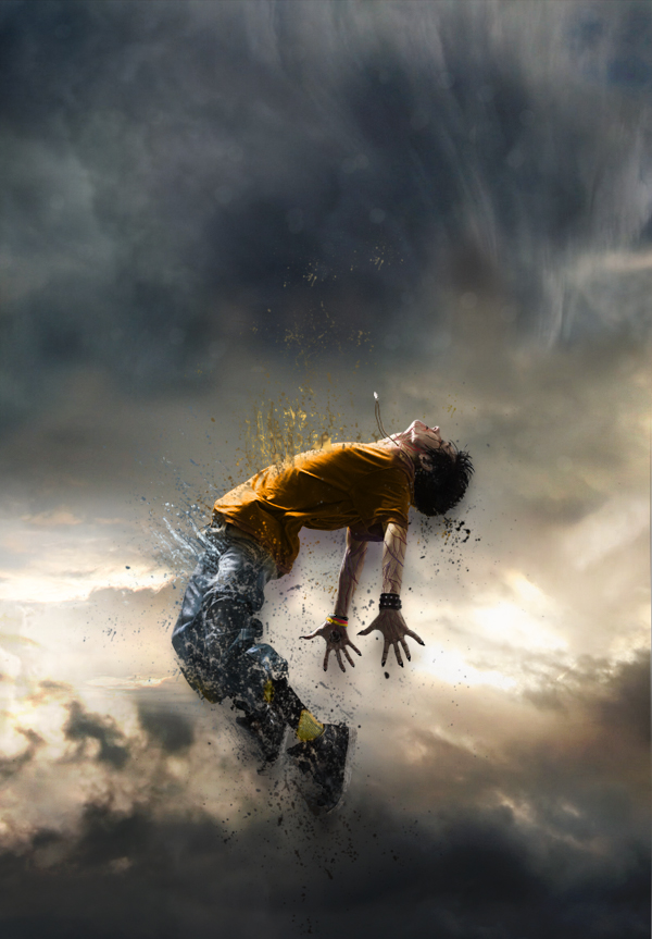
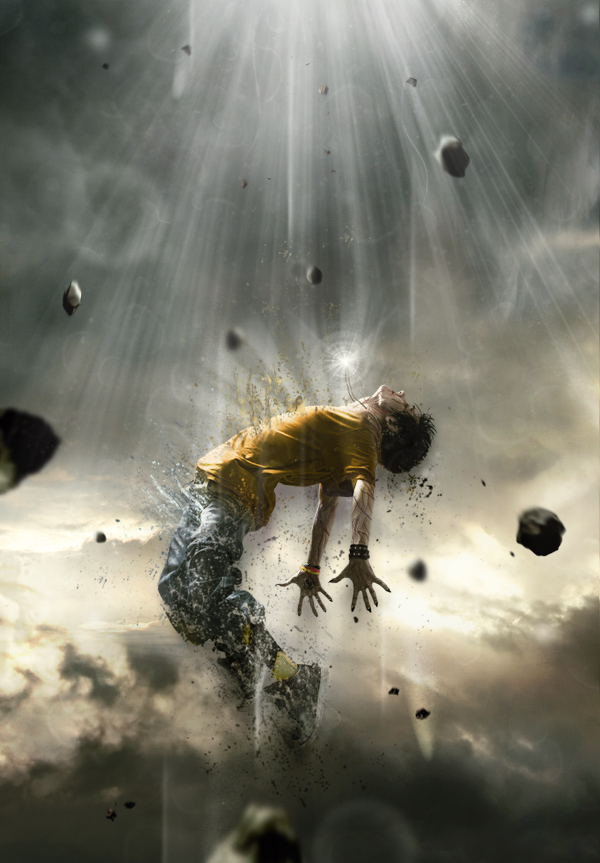
Human Disintegration Effect
In this tutorial we will create a powerful, and emotional human disintegration effect in Photoshop. Let’s get started!
Tutorial Assets
The following assets were used during the production of this tutorial.
Character
Sky
Meteors
Light (Obsidian Dawn)
Splatters
Step 1
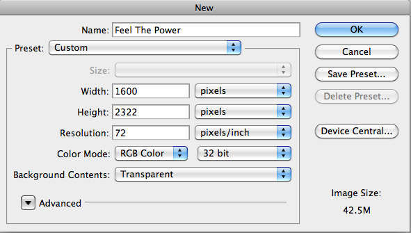
Let’s start by creating a new document in Adobe Photoshop. Choose the size of document you prefer, but try to keep it in a vertical shape, with a transparent background.
Step 2
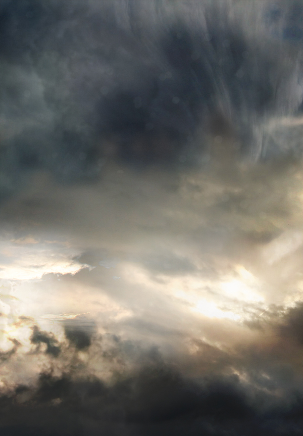
Then, find a good stock image of a cloudy sky that you can use as a background. You can also do like I did by interweaving several pictures of clouds to create the background you prefer. Make sure that the clouds are "dark" enough for a final atmosphere that will fit with the other elements you will be adding to your creation.
Step 3
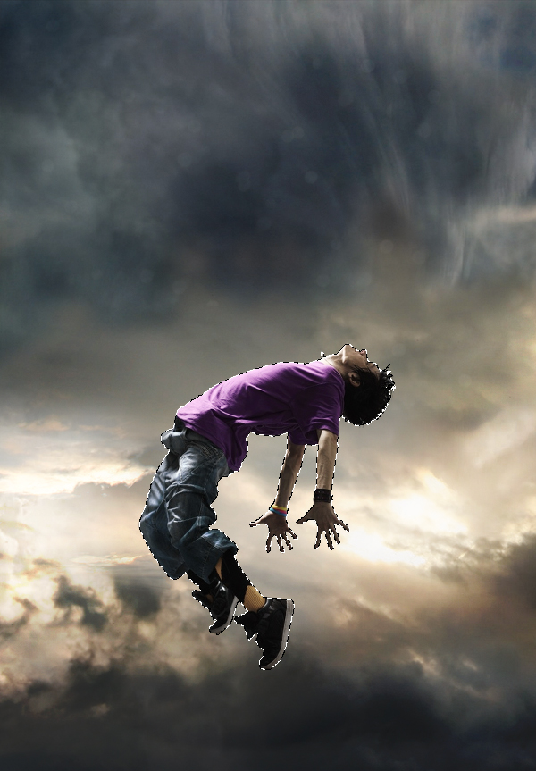
The next step is very important since you will have to choose the character that will be the main focus of your whole piece. To do this, go to websites like SXC, Fotolia, iStock, etc.., and choose a model that projects a strong emotion. Be sure to pick a character that really inspires you, as it will be the main focus of your creation and it will play a major role in your final outcome. Once you’ve selected it, cut out the character carefully by using the pen tool (P) and place it in the middle, slightly shifted downwards.
Step 4
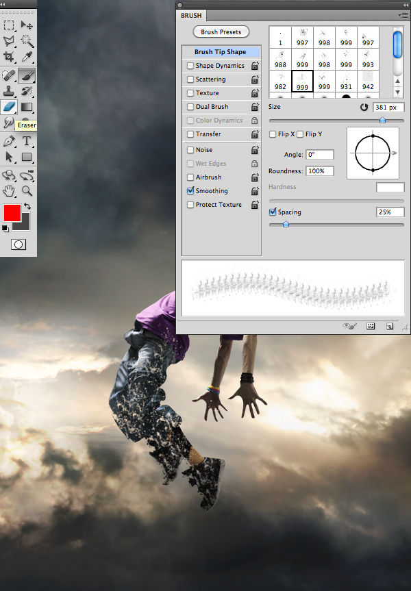
Then, using the eraser tool (E) with the “Splatters” shape – which can be found in the tutorial assets – slightly erase the character’s legs.
Step 5
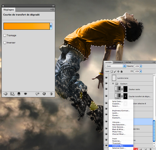
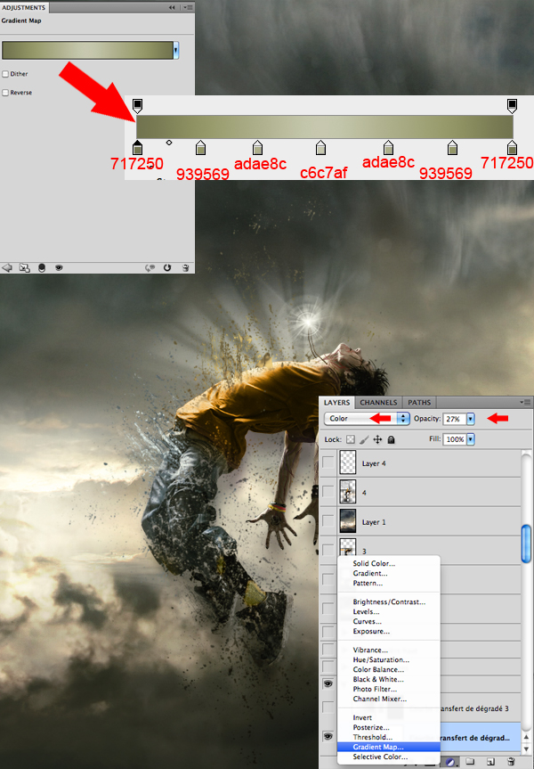
Now, if you are like me and like to change your character’s colors, take the lasso tool (L) and surround the selected areas from your character that you would like to modify. Afterwards, create a layer of fill or adjustment by clicking on the black and white circle situated in the layers tab. In the said tab you will be able to select the method that suits you best. I personally recommend changing the colors with a Gradient Map layer and a Selective Color layer. A tip: avoid fluorescent colors and choose those that resemble your background’s colors.
Step 6
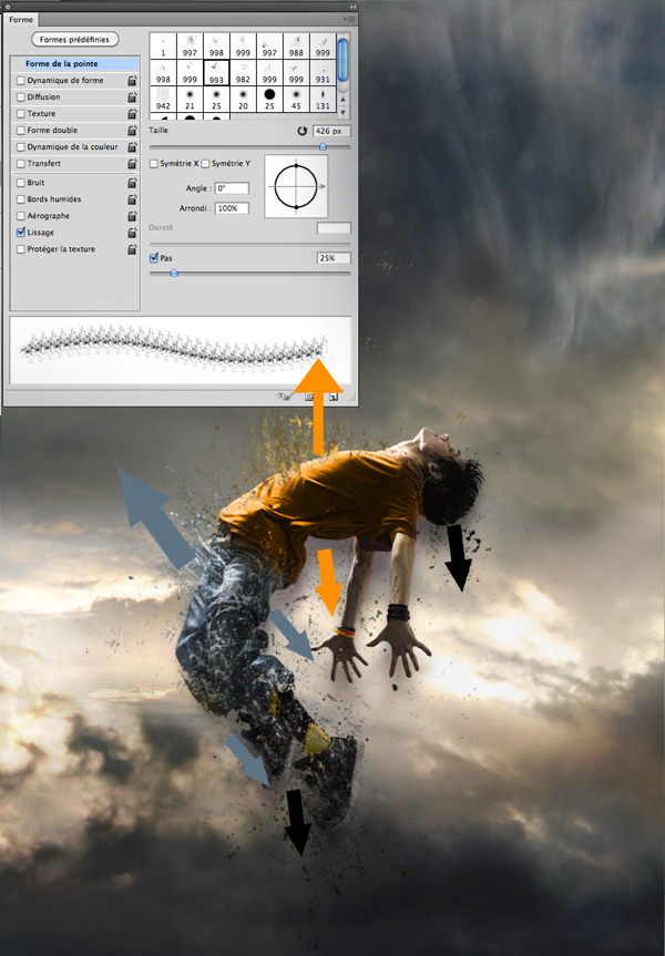
Always with the “Splatters” shape, take your brush tool (B) and, on another layer, create shapes that go above, but also behind the model, as seen in the picture bellow. It is important to use the same colors and shades that you’ve used on your character to create the desired effect of disintegration.
Step 7
There are numerous ways to give a darker aspect to your character and create the impression that he is possessed. Personally, I usually prefer to draw intense red veins on his arms, neck and face, as well as slightly darkening the eyes and mouth with a small black brush adjusted to “Soft Light”.
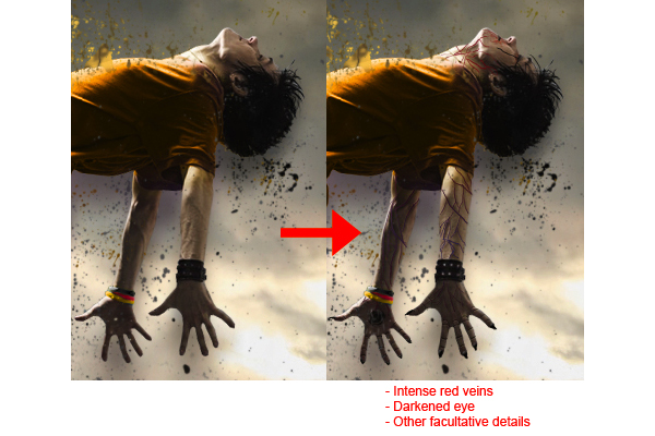
NOTE: MUNG NAHIHIRAPAN KAYU GAWIN TONG STEP 7 SKIP NYU SA KUMP NA KAYO SA STEP ACTUALLY DI NAMN KELANGAN TO..
Step 8
Here, I decided to create a necklace that will later have a supernatural look, suggesting that the character is flying up due to the strength of the accessory. Everything is done with a small brush, by using a graphic tablet.
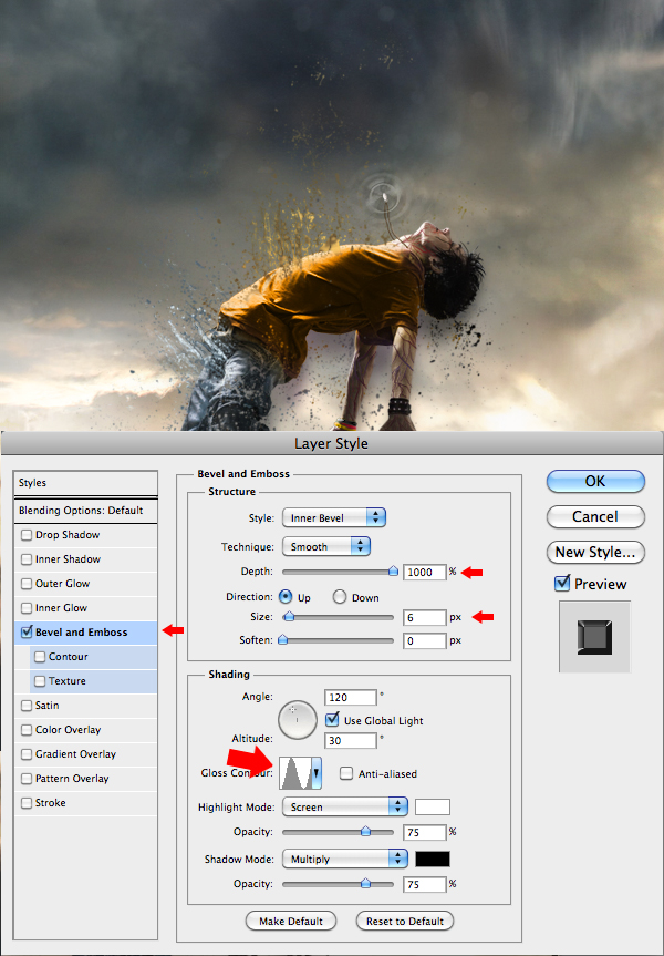
Step 9
Now this step will give the necklace a supernatural look. In order to achieve that, you will need to create "power waves" emitting from the necklace. On another layer, apply a white area on the necklace using a soft round brush, and then with a smaller soft round shape, erase the middle of that white area. When it’s done, “double click” on the layer to open the “Layer Style” box and enter the data as shown in the picture. Once you’ve done all that, duplicate the layer (Command/Ctrl + J) twice and make them bigger than the previous one. Remember, the more the wave is away from the necklace, the more it’s big and less opaque.
Step 10
To complete the work on the necklace, select the shapes titled “Light” available in the tutorial assets, select your brush (B), and on another layer create a white "light beam" effect coming out of the necklace.
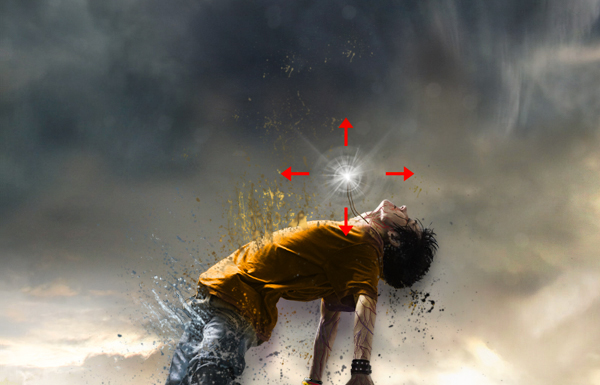
Step 11
With the same brush shapes, create a white "light beam" effect coming out of the model’s torso, as shown in the image. This effect will give out the impression that your character is liberating some sort of supernatural strengths while disintegrating.
Step 12
Now that most of the work on the character is done, you will need to work a little bit more on the atmosphere. With the fill or adjustment layer, at the bottom of the layers tab, darken the colors and make them closer to those of your character. Again, there are several ways to do so, but I suggest the Gradient Map layer and the Selective Color layer.
Step 13
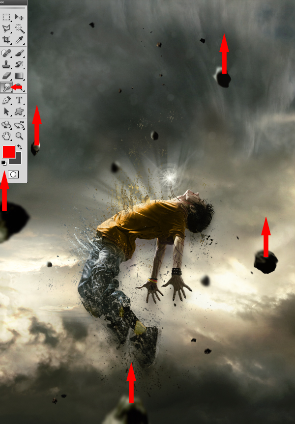
Afterwards, put some action in the scenery by adding meteors coming down from the top. You will find a pack of meteorites in the tutorial assets. Insert them one by one, making sure that their sizes vary and that their colors stick with the atmosphere.
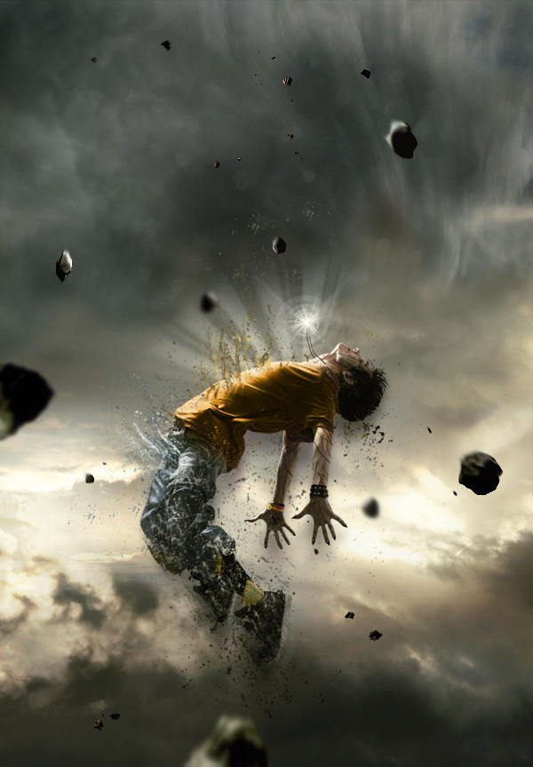
Step 14
This next step will consist in using the blur tool on the meteorites to make them look either close or far. Those that will be situated at the same distance as your character will remain untouched. Basically, the more a meteorite is far from the model, the greater the blur.
Step 15
Now, take the Smudge tool with strength of 5 to 10% and apply it on each of the meteorites, using little movements from bottom to top, to give them a speed effect.
Step 16
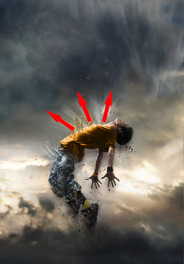
To create a source of light coming from above of your character’s body, take a white brush tool (B) with the same “Light” shape used in Step 10 and 11. It is important that the rays coming from above are more intense than those coming from your character’s torso. You can also draw various small shapes that follow the same rays’ movements to make it look more magical.
Step 17
Once you’ve completed the previous step, return to your character to improve it. With the presence of the new light source from above of your character’s body, you must increase the light reflected on its torso and face area by using a soft round white brush adjusted to “Overlay” mode.
Step 18
Now, draw some light effects passing around your model’s body so he can be integrated better within the scenery and be surrounded by more power.
Step 19
You can always add more “Splatters” if you find that the model does not disintegrate the way you want it to.
Step 20
To finalize everything, you can return to the colors, contrast and even intensify the bright areas with the same techniques you’ve used before. Basically, this step consists in putting your last personal touch to your piece! When you feel that your piece is finished, use a sharpness filter, to ensure a better overall quality, by duplicating your final image and by going to Filter > Sharpen > Sharpen.
oh finish na tayo hahah i hope you like this simple tutorial
etong tutorial na to ay natutunan ko lang din at iniimprove ko pa hahah...

ang gagaling!penge ako ng mga tutorial nito!salamat!
anu po yang pinag aaralan mo sir? mukhang maganda ah...kayang kaya mo yan sir!
share q lang po....
Step 1 - Place the background
The first step it’s to place the sky, our background, into the image. As you can see, we have changed the color of it. We’re going to create a half of the image with a warm tone and another with a cool tone using the color balance tool. To do this, select the sky and then choose Image > Adjustments > Color Balance. Adjust the input sliders to add red and yellow. Select “highlights” and “shadows” then try adding more of these colors until you like the tones in your image.
Step 2 - Coloring the sky
Duplicate the layer with the sky. Now we are going to repeat the previous step with the color balance tool (Image > Adjustments > Color Balance) but this time adding blue and cyan tones. Remember to add some color to highlights and shadows as well.
Select the eraser tool then, in the option bar, select a blurred brush like shown below:
Now use the eraser tool to erase the left side of the sky in the top layer. This will make the warm tones from the layer below appear wherever you paint. When using the eraser, create curved strokes rather than a straight cut. When you have finished this step, you can reduce the opacity of the current layer to make the color more subtle.
Step 3 – Add the model
Now let’s open picture of the model. Use the magic wand tool to create a selection of the model then click on the add layer mask button in the layers palette to create a mask of the model. Refine the mask by painting in the layer mask using a brush with a harder edge. When you’re done, position the woman in the centre of the image.
Step 4 - Coloring the model
As you can see the lighting of the model isn’t blending in well with the background. We’re going to fix this with the levels tool. Choose Image > Adjustments > levels and move the input sliders to add contrast that matches the contrast of the background
Now choose Image > Adjustments > Hue/Saturation and reduce the saturation to reduce the saturation created when we used the levels tool. For the image used in this tutorial, the saturation was reduced by –24.
The next step will be exactly the same that in step 2 (when we used the color balance tool) except we’re going to use it on the model. First, duplicate the layer with the model so that you have two layers. Select one of the layers with the model then, like step two, use the color balance tool (Image > Adjustments > Color Balance) to add some red/yellow tones.
As you can see, it looks blended better with the left half of the background. Now, select the other layer of the model then choose Image > Adjustments > Color Balance and add some blue and cyan tones.
Now, as you did before with the sky, use the eraser tool with a soft edge to remove the left side of the layer with the girl in blue tones. Reduce the opacity on the current layer to reduce the strength of the color effect.
We’ve done the hardest part matching the lighting of the model with the background. Merge the layers of the model into one layer. Now you can play again withthe levels, color balance, and saturation (found in the Image > Adjustments menu) to make further adjustments.
Step 5 - Lightning the model
For the image used in this tutorial, the light comes from the background left. And to make the lighting match, we’ll have to darken the back of the model. To begin, select the burn tool.
Use a soft brush, edit the midtones, and set the exposure to around 30%.
Now use the brush over the models back. Try not make it too dark, just a little. Use this tool in the skirt too.
After that, select the dodge tool and paint the outline of the model (especially in her hair and her left arm).
Step 5 - Roots
Now we are going to add some roots and branches to the body of the model. It’s not difficult and you just need some images of trees and roots. We will be cutting parts of the root and tree and giving them some color like we did earlier with the color balance tool.
First step will be to look for a beautiful root and select it with your favorite tool (Magnetic lasso or quick mask mode for example). Don’t worry if it’s not a perfect selection, we will modify it later. Copy it and paste in our image.
As you can see the new image has not the same light and colors that the others, it looks out of place. What we have to do it’s the same that we did with the sky and the girl. Choose Image > Adjustments > Levels and adjust the input sliders. If you move the one in the center to the left the image will be brighter. If you move it to the right the image will be darker. In our case we are going to move to the right.
Now choose Image > Adjustments > Color Balance and add color depending of the place where you are going to put the root. If the root it’s on the left arm of the girl, for example, it will need red and yellow. But if it is on the right arm you have to add blue and cyan. This time we are going to add yellow and red. This is how it looks with the modifications:
When you have the root ready, just place it where you think that it will look good and select the eraser tool with a focus brush. Erase all the part that you don’t need and give the correct form to the root, now it’s when you have to improve the selection root.
The final step will be to use the burn tool in the areas where we should see shadows. For example, in the image below, it was used over the arm or in the bottom. I have added a little of blue using Image > Adjustments > Color Balance too. The last step is to erase the upper part of the root to create the look of a crease.
All the roots are added using the same process. The biggest impact to your results is choosing the photos. Once you have good photos to work with, you’ll have no problem getting good results using this technique.
There is just one last detail to explain. Sometimes, to get a more realistic feeling you can add a shadow to the root that falls over the skin or the dress. Take a look to this picture:
The only difference it’s the shadow on the right arm. To make this shadow just need to make double click over the root layer and the layer style menu will be open (or choose Layer > Layer Style > Drop Shadow). Select Drop Shadow and then use the arrow to move the shadow with freedom. When you have putted the shadow in the correct place just use the opacity bar in the drop shadow menu to add more or less intensity.
Step 6 - Ground and grass
Now we’re going to add the ground. The first picture used it’s a simple ground with sand taken from a photo of a beach.
The grass is taken from different photographs. First, create a new layer for the grass and position it behind low the layer with the model. Select and cut different parts of grass then mix them to create a field of grass like the image below.
This layer with the grass should be positioned between the layer with the model and the layer with the ground. Create a new layer and position it above the layer with the model and add some grass to cover the back of the models feet.
Finally, carefully add some grass and stone over the edge of the grass and the ground to hide the hard edges. It’s important that you inspect the edges thoroughly to hide any imperfections.
Step 7 – Add more roots
Now we’re going to add roots and flowers in the close-up. If you have read all the previous steps, you’ll have no trouble doing this. As mentioned before, it is very important that you choose good photos to work with. The photos should be high quality and in focus from foreground to background. If you use low resolution images, the finished results will look poor.
With this in mind, use a variety of photographs of flowers, roots, and trunks. Cut them out carefully with the lasso or quick mask tool and paste in the photo manipulation. Use the same coloring technique with the color balance tool (Image > Adjustments > Color Balance) that we used several times earlier.
To complete the blending of these images, we’re going to add to the ground. There are two ways to do this:
This is the one that I explained at the end of step 5. Using the drop shadow in the layer style menu (Layer > Layer Style > Drop Shadow).
Selecting the layer with the ground and using the burn tool in the areas where the shadows fall.
Step 8 - Dust
Now we are going to create some dust next to the feet of the girl. Use a picture with a cloudy sky then select one cloud using the lasso tool.
Copy it and paste in our document then choose Image > Adjustments > Levels. Move the middle input slider to the right to darken the cloud.
Then use the eraser tool in the edge of the cloud with a soft edge brush. Finally, choose Filter > Blur > Motion Blur and add the blur from left to right about 7 or 8 pixels. Position this layer behind the layer with the model. Duplicate the layer then move the new layer above the layer with the model. On this new layer, use the levels tool again but this time move the central input slider to the left to brighten the cloud.
The last retouching work will be to add red and yellow tones by using the color balance tool (Image > Adjustments > Color Balance).
Step 9 - Final Roots
We’re going to add the final roots. We need them to be positioned in a zigzag shape on the body of the model. To make this effect, we will need a combination of root photos like shown in the image below.
As always, the first step will be to select and match the different colors and lights of the roots using the levels tool (Image > Adjustments > Levels) and the color balance tool (Image > Adjustments > Color Balance). use the eraser with a soft edge to erase all that you don’t need and to give the ends of the roots a faded effect (so that they can be connected easily afterwards). Here is an example of combining different roots to create a large root:
It’s less difficult than it looks. Just be patient to find good images of roots and combine them using the same technique.
Step 10 - Some details
To make our photo manipulation more attractive we are going to add more details like flowers, petals, and a bird. I chose photos with objects that are easy to isolate. This will speed things up and ensure good results.
Step 11 - Adjustments Layers
To complete the photo manipulation, we’re going to add some adjustments layers. Select the upper layer then choose Layer > New Adjustment Layer > Hue/Saturation. Reduce the saturation by about –10 or to your likings. Experiment with using other adjustment layers to alter the color and effect of the final image.
Final Result
Making a complex photo manipulation like this is not difficult if you follow the a few principles of photo manipulation. Some important principles are:
Choose good photos to start with.
Make sure that the lighting and color of the objects in your composition match.
Don’t rush. Take your time to find good images to work with and carefully blend them together. Ensure that there are no artifacts or unclean edges.
Enjoy..Happy Editing,
ang galing!!!
Maraming salamat ts!
try ko to mamaya
thanks
ang gagaling!penge ako ng mga tutorial nito!salamat!
pa-bookmark TS....gusto ko din matuto ehhh kahit super noob tlga ako pagdating sa photoshop....wla pa kahit konting idea...hehehe