Symbianize Forum

Most of our features and services are available only to members, so we encourage you to login or register a new account. Registration is free, fast and simple. You only need to provide a valid email. Being a member you'll gain access to all member forums and features, post a message to ask question or provide answer, and share or find resources related to mobile phones, tablets, computers, game consoles, and multimedia.

All that and more, so what are you waiting for, click the register button and join us now! Ito ang website na ginawa ng pinoy para sa pinoy!

Beginners' Guide to Adobe Photoshop

salamat dito ts malaking tulong ito sa lahat
ETO PA DAGDAGAN ULIT NATIN NG ISA PANG TUTORIAL

THIS TIME NEXT LEVEL NA TYO​

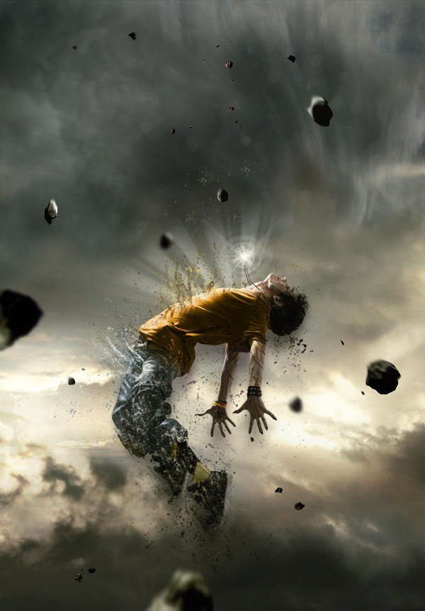
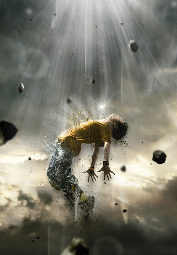
Human Disintegration Effect​

In this tutorial we will create a powerful, and emotional human disintegration effect in Photoshop. Let’s get started!​

Tutorial Assets
The following assets were used during the production of this tutorial.
Character
Sky
Meteors
Light (Obsidian Dawn)
Splatters

Step 1
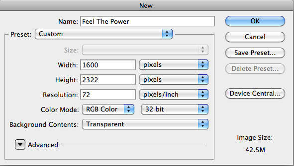
Let’s start by creating a new document in Adobe Photoshop. Choose the size of document you prefer, but try to keep it in a vertical shape, with a transparent background.
Step1.jpg


Step 2
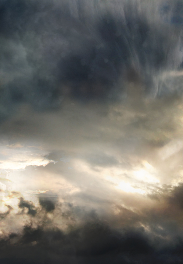
Then, find a good stock image of a cloudy sky that you can use as a background. You can also do like I did by interweaving several pictures of clouds to create the background you prefer. Make sure that the clouds are "dark" enough for a final atmosphere that will fit with the other elements you will be adding to your creation.
Step2.jpg


Step 3
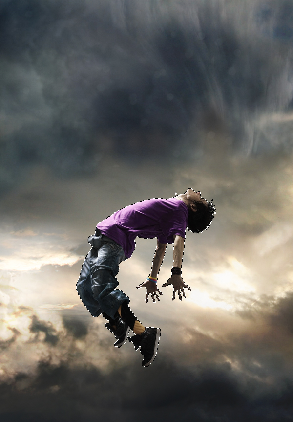
The next step is very important since you will have to choose the character that will be the main focus of your whole piece. To do this, go to websites like SXC, Fotolia, iStock, etc.., and choose a model that projects a strong emotion. Be sure to pick a character that really inspires you, as it will be the main focus of your creation and it will play a major role in your final outcome. Once you’ve selected it, cut out the character carefully by using the pen tool (P) and place it in the middle, slightly shifted downwards.
Step3.jpg


Step 4
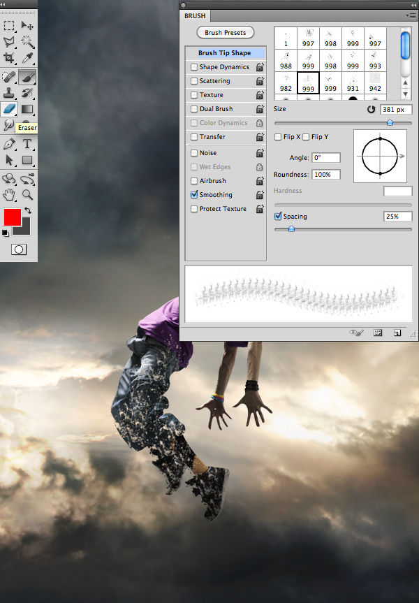
Then, using the eraser tool (E) with the “Splatters” shape – which can be found in the tutorial assets – slightly erase the character’s legs.
Step4.jpg


Step 5
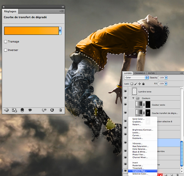
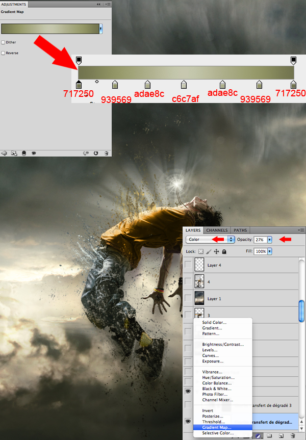
Now, if you are like me and like to change your character’s colors, take the lasso tool (L) and surround the selected areas from your character that you would like to modify. Afterwards, create a layer of fill or adjustment by clicking on the black and white circle situated in the layers tab. In the said tab you will be able to select the method that suits you best. I personally recommend changing the colors with a Gradient Map layer and a Selective Color layer. A tip: avoid fluorescent colors and choose those that resemble your background’s colors.
Step5.jpg


Step 6
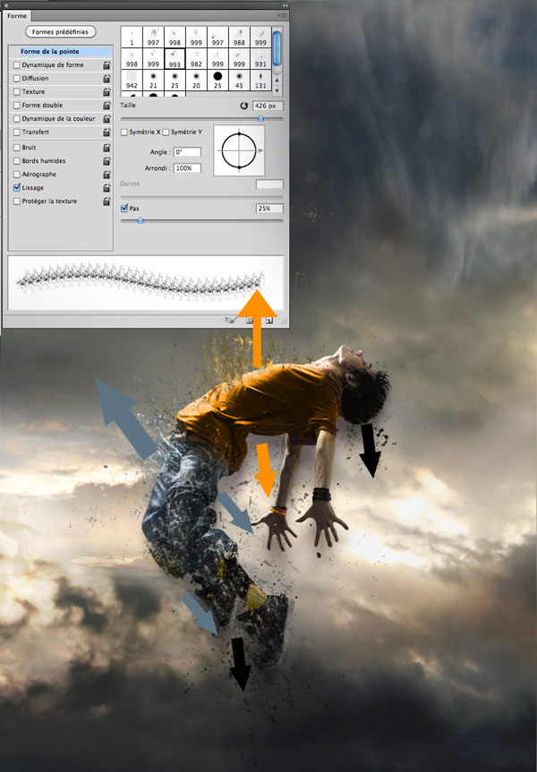
Always with the “Splatters” shape, take your brush tool (B) and, on another layer, create shapes that go above, but also behind the model, as seen in the picture bellow. It is important to use the same colors and shades that you’ve used on your character to create the desired effect of disintegration.
Step6.jpg


Step 7
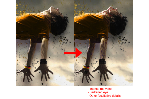
There are numerous ways to give a darker aspect to your character and create the impression that he is possessed. Personally, I usually prefer to draw intense red veins on his arms, neck and face, as well as slightly darkening the eyes and mouth with a small black brush adjusted to “Soft Light”.
Step7.jpg

NOTE: MUNG NAHIHIRAPAN KAYU GAWIN TONG STEP 7 SKIP NYU SA KUMP NA KAYO SA STEP ACTUALLY DI NAMN KELANGAN TO..

Step 8
Here, I decided to create a necklace that will later have a supernatural look, suggesting that the character is flying up due to the strength of the accessory. Everything is done with a small brush, by using a graphic tablet.
Step8.jpg


Step 9
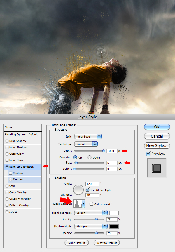
Now this step will give the necklace a supernatural look. In order to achieve that, you will need to create "power waves" emitting from the necklace. On another layer, apply a white area on the necklace using a soft round brush, and then with a smaller soft round shape, erase the middle of that white area. When it’s done, “double click” on the layer to open the “Layer Style” box and enter the data as shown in the picture. Once you’ve done all that, duplicate the layer (Command/Ctrl + J) twice and make them bigger than the previous one. Remember, the more the wave is away from the necklace, the more it’s big and less opaque.
Step9.jpg


Step 10
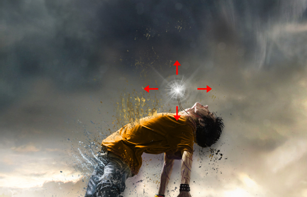
To complete the work on the necklace, select the shapes titled “Light” available in the tutorial assets, select your brush (B), and on another layer create a white "light beam" effect coming out of the necklace.
Step10.jpg


Step 11
With the same brush shapes, create a white "light beam" effect coming out of the model’s torso, as shown in the image. This effect will give out the impression that your character is liberating some sort of supernatural strengths while disintegrating.
Step11.jpg


Step 12
Now that most of the work on the character is done, you will need to work a little bit more on the atmosphere. With the fill or adjustment layer, at the bottom of the layers tab, darken the colors and make them closer to those of your character. Again, there are several ways to do so, but I suggest the Gradient Map layer and the Selective Color layer.
Step12.jpg


Step 13
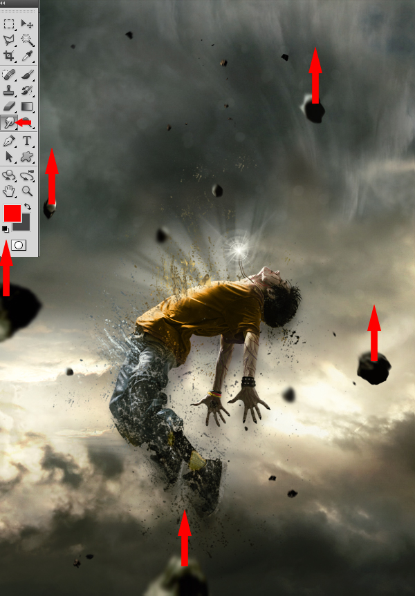
Afterwards, put some action in the scenery by adding meteors coming down from the top. You will find a pack of meteorites in the tutorial assets. Insert them one by one, making sure that their sizes vary and that their colors stick with the atmosphere.
Step13.jpg


Step 14
This next step will consist in using the blur tool on the meteorites to make them look either close or far. Those that will be situated at the same distance as your character will remain untouched. Basically, the more a meteorite is far from the model, the greater the blur.
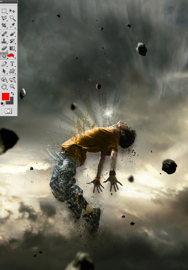
Step14.jpg


Step 15
Now, take the Smudge tool with strength of 5 to 10% and apply it on each of the meteorites, using little movements from bottom to top, to give them a speed effect.
Step15.jpg


Step 16
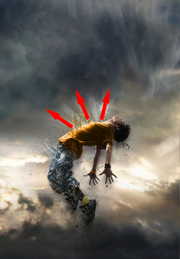
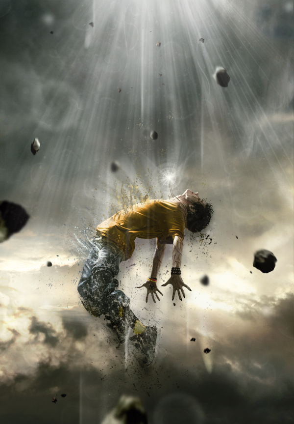
To create a source of light coming from above of your character’s body, take a white brush tool (B) with the same “Light” shape used in Step 10 and 11. It is important that the rays coming from above are more intense than those coming from your character’s torso. You can also draw various small shapes that follow the same rays’ movements to make it look more magical.
Step16.jpg


Step 17
Once you’ve completed the previous step, return to your character to improve it. With the presence of the new light source from above of your character’s body, you must increase the light reflected on its torso and face area by using a soft round white brush adjusted to “Overlay” mode.
Step17.jpg


Step 18
Now, draw some light effects passing around your model’s body so he can be integrated better within the scenery and be surrounded by more power.
Step18.jpg


Step 19
You can always add more “Splatters” if you find that the model does not disintegrate the way you want it to.
Step19.jpg


Step 20
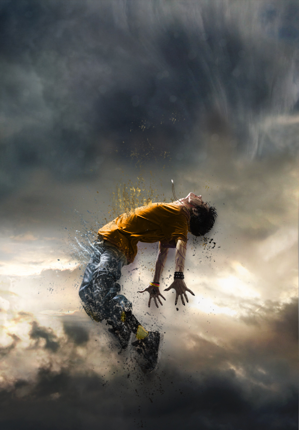
To finalize everything, you can return to the colors, contrast and even intensify the bright areas with the same techniques you’ve used before. Basically, this step consists in putting your last personal touch to your piece! When you feel that your piece is finished, use a sharpness filter, to ensure a better overall quality, by duplicating your final image and by going to Filter > Sharpen > Sharpen.
Step19.jpg


oh finish na tayo hahah i hope you like this simple tutorial
etong tutorial na to ay natutunan ko lang din at iniimprove ko pa hahah...
 
wow ang galing HANGA AKO...THANKS

salamt po

Ayos to sir. Naeexcite tuloy ako matuto sa photoshop. Ang galing ng tutorial. :thumbsup: ako dito. More pa sir.

Sir habang nag-aaral pa ko ng tutorial mu baka pwede na rin magtanung total expert ka naman dito :lol:
Gusto ko po sana kasi gawin etong raw
attachment.php

Para maging ganito. Size po nito ay 640x464 png.
attachment.php

ay sir di ako masyadong expert hahah :D anu pong gagawin sa photos na yan?

Thank you TS

I just installed PS CS5 para dito sa tut mo... di pa talaga ako makasunod :p

di bale everytime bakante ako daan ako dito thread mo, akala ko madali lang nahirapan ako ha ;)

:thumbsup:

haha ganyan lang talaga sa una pero mahahasa ka rin sir i hope you can do it..


walang anu man

now lang ulit nakapag online..waw dami na bago ah. keep it up sir. :salute::salute::thumbsup::thumbsup:

welcome back sir


salamat dito ts malaking tulong ito sa lahat

walang anu man
 
Astig na tutorial:thumbsup:
Baguhan lang ho ako sa Photoshop;)
 
daming qng paperwork, :weep::weep:

post muna ako sir, share ko lang tong tutorial;

Step 1

Open Photoshop and create a new document. I used 1920x1200. After that select the background layer and go to Layer>Layer Style>Grandient Overlay. Use #150b06 and # 321c0f for the gradient colors, Radial for Style and Normal for Blend Mode.

Step_1.jpg


Step 2

Create a new layer and go to Filter>Render>Clouds. Make sure that the colors were black and white for the foreground an background.

Step_2.jpg


Step 3

Change the Blend Mode of the Clouds layer to Color Dodge.

Step_3.jpg


Step 4

Select the Eraser Tool (E). Use a regular brush. Change the Hardness to 0% and use a big size. Now erase some areas, just leave the center like the image bellow.

Step_4.jpg


Step 5

Place the logo and aling it in the center of the document. Go to Layer>Layer Styles>Outer Glow. Use #fffde2 for the color, Color Dodge for the Blend Mode, 80% opacity, 18% for the Spread and 18 pixels for the Size. That will create a nice glowing logo.


Step_5.jpg


Step 6

This tip was from my friend Cameron, he sent me this image and told me that it would be a nice way to create some effects like the Hejz work. You can download the image here.


Step_6.jpg


Step 7

Cut an area of the image and paste it in your document. Rotate and resize it to fit with the symbol. After that change the Blend Mode to Screen.

Step_7.jpg


Step 8

Now go to Image>Adjustments>Levels. Increase the black and the a bit of the white of the image. That's necessary to match the colors of the image with the backgournd.


Step_8.jpg


Step 9

Go to Edit>Transform>Scale, reduce the size of the streaks. Then go to Edit>Transform>Warp. Move the grid to make the streaks follow the symbol.

Step_9.jpg


Step 10

Go to Image>Adjustments>Hue and Saturation. Increase the Saturation and the Hue. Reduce the Lightness.

Step_10.jpg


Step 11

Duplicate the sparks layer. Go to Edit>Transform>Flip Vertical. Then resize it and adjust the position like the image below.

Step_11.jpg


Step 12

Copy another art of the original Photo and paste it in your document. Repeat the steps 8, 9, and 10.

Step_12.jpg


Step 13

Repeat again the Steps 8,9, and 10 to create a tail to the symbol, like the image below.

Step_13.jpg


Step 14

Now lets create some stars, I have explained this in other tutorials so I won't spent too much time again. Basically just create a new layer and fill it with black. Make sure you have black and white for the background and foreground colors. Then go to Filter>Noise>Add Noise. Use Gaussian for, 15% Amout, and Monochromatic. Then change the layer's Blend Mode to Screen and go to Image>Adjustments>Levels. Increase the black and white levels untill you get nice stars. Then just repeat the same steps again in this same layer.


Step_14.jpg


Conclusion

Now just add some texts and other small effects like the glow behind the golf club. This sort of exercise is really cool because we can learn a lot from how to create some effects or famous brand styles such as Nike, Apple, Adidas, and others. These companies have their own style so you can play with that in order to learn how to reproduce that in your own design.


Step_16.jpg


happy editing!
 
Astig na tutorial:thumbsup:
Baguhan lang ho ako sa Photoshop;)

haha kahit po kao baguhan lang din sa photoshop :lol:

daming qng paperwork, :weep::weep:

post muna ako sir, share ko lang tong tutorial;

Step 1

Open Photoshop and create a new document. I used 1920x1200. After that select the background layer and go to Layer>Layer Style>Grandient Overlay. Use #150b06 and # 321c0f for the gradient colors, Radial for Style and Normal for Blend Mode.

Step_1.jpg


Step 2

Create a new layer and go to Filter>Render>Clouds. Make sure that the colors were black and white for the foreground an background.

Step_2.jpg


Step 3

Change the Blend Mode of the Clouds layer to Color Dodge.

Step_3.jpg


Step 4

Select the Eraser Tool (E). Use a regular brush. Change the Hardness to 0% and use a big size. Now erase some areas, just leave the center like the image bellow.

Step_4.jpg


Step 5

Place the logo and aling it in the center of the document. Go to Layer>Layer Styles>Outer Glow. Use #fffde2 for the color, Color Dodge for the Blend Mode, 80% opacity, 18% for the Spread and 18 pixels for the Size. That will create a nice glowing logo.


Step_5.jpg


Step 6

This tip was from my friend Cameron, he sent me this image and told me that it would be a nice way to create some effects like the Hejz work. You can download the image here.


Step_6.jpg


Step 7

Cut an area of the image and paste it in your document. Rotate and resize it to fit with the symbol. After that change the Blend Mode to Screen.

Step_7.jpg


Step 8

Now go to Image>Adjustments>Levels. Increase the black and the a bit of the white of the image. That's necessary to match the colors of the image with the backgournd.


Step_8.jpg


Step 9

Go to Edit>Transform>Scale, reduce the size of the streaks. Then go to Edit>Transform>Warp. Move the grid to make the streaks follow the symbol.

Step_9.jpg


Step 10

Go to Image>Adjustments>Hue and Saturation. Increase the Saturation and the Hue. Reduce the Lightness.

Step_10.jpg


Step 11

Duplicate the sparks layer. Go to Edit>Transform>Flip Vertical. Then resize it and adjust the position like the image below.

Step_11.jpg


Step 12

Copy another art of the original Photo and paste it in your document. Repeat the steps 8, 9, and 10.

Step_12.jpg


Step 13

Repeat again the Steps 8,9, and 10 to create a tail to the symbol, like the image below.

Step_13.jpg


Step 14

Now lets create some stars, I have explained this in other tutorials so I won't spent too much time again. Basically just create a new layer and fill it with black. Make sure you have black and white for the background and foreground colors. Then go to Filter>Noise>Add Noise. Use Gaussian for, 15% Amout, and Monochromatic. Then change the layer's Blend Mode to Screen and go to Image>Adjustments>Levels. Increase the black and white levels untill you get nice stars. Then just repeat the same steps again in this same layer.


Step_14.jpg


Conclusion

Now just add some texts and other small effects like the glow behind the golf club. This sort of exercise is really cool because we can learn a lot from how to create some effects or famous brand styles such as Nike, Apple, Adidas, and others. These companies have their own style so you can play with that in order to learn how to reproduce that in your own design.


Step_16.jpg


happy editing!

lupet mo tlaga sir :thumbsup:

Up po sa tanung ko sana may makatulong sa akin. :pls:

Ano po ba yung tanong mo sir>?
 
javachip27 said:
Ayos to sir. Naeexcite tuloy ako matuto sa photoshop. Ang galing ng tutorial. :thumbsup: ako dito. More pa sir.

Sir habang nag-aaral pa ko ng tutorial mu baka pwede na rin magtanung total expert ka naman dito :lol:
Gusto ko po sana kasi gawin etong raw
attachment.php

Para maging ganito. Size po nito ay 640x464 png.
attachment.php

pandasauure said:
Ano po ba yung tanong mo sir>?

Yan po sir, yung transparency po ng horizontal sa upper and bottom part ng picture pati yung corner niya. Gusto ko kasi magawa yan para sa dashboard.:lol: Sana po matulungan niyo ko.
 
Last edited:
Yan po sir, yung transparency po ng horizontal sa upper and bottom part ng picture pati yung corner niya. Gusto ko kasi magawa yan para sa dashboard.:lol: Sana po matulungan niyo ko.


sir ung ganito po ba??
 

Attachments

  • Test1.jpg
    Test1.jpg
    516.4 KB · Views: 6
Last edited:
Yan po sir, yung transparency po ng horizontal sa upper and bottom part ng picture pati yung corner niya. Gusto ko kasi magawa yan para sa dashboard.:lol: Sana po matulungan niyo ko.

ah yung transparency nung beats headset ba yung nasa baba nya... yung tinutukoy mo?

tnx sa tutorials mo ts:clap:

walang anuman sir
 
ah yung transparency nung beats headset ba yung nasa baba nya... yung tinutukoy mo?

Hindi po. Yung gusto ko pong gayahin is yung transparent na horizontal sa bumblebee image na ia-apply sa beats image. Eto po yung gawa ni sir criticalgrave mejo malapit na yung gawa niya. Pakituro naman po kung panu. Gusto ko malaman kung panu yan pati yung corner/border ng bumblebee image. Eto po yung gawa ni sir here
 
Last edited:
Hindi po. Yung gusto ko pong gayahin is yung transparent na horizontal sa bumblebee image na ia-apply sa beats image. Eto po yung gawa ni sir criticalgrave mejo malapit na yung gawa niya. Pakituro naman po kung panu. Gusto ko malaman kung panu yan pati yung corner/border ng bumblebee image. Eto po yung gawa ni sir here

Cge hanap ako ng tutorial nyan pero di ako sure :3
 
oUT NA Muna tulog na muna ko haha bukas naman ulit :sleep:
 
Opo ganyan nga po. Pwede po malaman kung panu yan? Pati na rin yung curve na nasa upper part?


Sir, emboss lang po xa sir, pinaka base background mo ung pic mo then gawa ka po ng isa pang layer, after nun gamitin mo po ung rectangular marquee/ ung oval or ung sa shape na tool, whichever u prefer. Ung sa baba po ay overlay lang po xa then babaan mo po ng opacity, ung sa top naman po sir ay click mo ung layer options/ double click mo ung layer, then lagyan mo po ng ng check ung sa emboss, kaw na po bahalang mag edit nung options dun to ur satisfaction, click mo na din ung inner shadow then edit mo narin ung options,

saglit ko lang po kasi naedit un kaya nd ko maxadong natutukan ng pansin, madami po kasi ako ginagawa this past few days,

practisin mo lang po sir makukuha mo din un, best advice ko nalang po is try nyo po mag experiment ng mag experiment sa photoshop, khit nd kau mag base sa mga tutorials, mas madali po nyo magagamay ung program...gud luck po and happy editing. :salute::salute::salute:
 
:work::work::work: Deadlines Coming up..:weep::weep::weep:


Share ko lang mga sir, :thumbsup:

kala ko na post ko na, nawalan pala ng net samen kala ko tuloy nadelete haha panget kasi ng ISP ko :upset: haha

Step 1:
Open up a new document 1000px wide and 600px high. Then paste an image of a laptop into your document. Create a new layer set called ‘laptop’ and put the layer containing your laptop image into this layer set.

screen1.jpg


Step 2:
Now I want to create a vanishing point for the screen of the laptop. Many Photoshop users, including myself, don’t yet have Photoshop CS2 or CS3, so this tutorial won’t utilize the useful vanishing point filter available in these versions. Instead, we’re going to manually create a fake vanishing point.

Select the screen part of your laptop using the lasso tool. Then copy your selection, create a new photoshop document, and paste in the selection. Go to image>image size and double whatever your image size is. In this case the original screen was 204px wide, so I simply doubled this to 408px.

Then paste this new larger screen back into your original document. Positioning it roughly where you think it looks good in terms of perspective.

screen2.jpg


Step 3:
Now select your line tool and a nice bright color for it and draw lines each corner of your large screen through to the matching corner of the original screen and past to a vanishing point. Do this with each corner of the laptop screen, until you have something like the image below:

screen3.jpg


Step 4:
Now duplicate your larger laptop screen and select edit>free transform. Then in the menu near the top of your screen (see diagram below) change the W (width) and H (height) percentages from 100% to 90%.

screen4a.jpg


Move this resized image so that it matches up with the perspective lines that you created earlier. Be sure to place this resized screen layer behind the largest screen layer but above your original laptop photo layer.

Repeat this process of duplicating/resizing/aligning using the resizing percentages of 80%, 70%, and 60% from your large screen layer. Remember that your original laptop photo is 50% of this large screen layer.

This is how your image should look after you have created this new screens and lined them up correctly:

screen4b1.jpg


Step 5:
Now create a new layer set called ‘photo 1′. Paste in the image that you want to manipulate. View a grid over your image and then use the free transform tool to resize your photo to fit nicely into the grid squares. Make sure that the photo fits into an even number of grid squares for it’s height and width. In this example the photo is resized to be 8 grid squares wide and 6 high.

screen5.jpg


Step 6:
Now duplicate your photo layer, as you want to retain a copy. Be sure to hide the duplicate layer and go back to your original. Select your single column marquee tool from your selection palette (it’s under the Rectangle and Elliptical marquee tools). Using your grid click the grid line that marks the center point of your image and delete a central 1px column. Then switch to the single row marquee tool and do the same to delete a 1px line across the center of your image. You want these lines to be a little larger than 1px though, so grab your magic wand tool and click somewhere outside of your photo image. This will select all of the area surrounding the photo, but also the 1px lines cutting through it. Then go to select>modify>expand and expand the selection by 3px. Then hit delete to achieve an effect like the image below:

screen6.jpg


Step 7:
Now hide all of your duplicate laptop screens except the smallest one (the one that is 60% of the size of your largest). With your photo layer selected (the one you’ve just cut up using the grid) go to edit>transform>distort and distort the photo so that it fits exactly over this smallest laptop screen image. To fit it well you make need to reduce the layer’s opacity to allow the screen underneath to show though. The image below shows the transformed photo layer at 57% opacity, allowing some of the screen underneath to show through. Be sure to move this photo layer below the next largest laptop screen layer, so that it is mostly covered by it.

screen8.jpg


Step 8:
Now go back to your original photo layer. Duplicate it again, and using the same technique as before with the single row/column marquee tools cut it into 2X2 squares using the grid. As the image is 8 squares wide and 6 high, this will result in 12 squares each 4 grid squares in size. Again, use your magic wand tool to select the area around the photo and the lines cutting through it, then expand your selection by 3px and hit delete. Then use the distort transform tool to fit your new image to the 2nd smallest laptop screen. Remember again to move this photo layer behind the next largest laptop screen layer. The image below shows the result of this, with the photo layer again at 57% to allow me to nicely fit it to the screen image beneath.

screen81.jpg


Step 9:
Now repeat these steps, but make your squares half the size each time. So using the grid that will then be 1X1, 1/2X1/2, 1/4X1/4. To cut the photo into 1/2 and 1/4 grid square pieces I would recommend just using your judgement, but if you want to be really picky you can use rulers. Another tip is to duplicate the photo after cutting it into the squares, as this will save you having to repeat the slicing process right from the start each time.

screen9.jpg


Step 10:
Here is the same image but with all duplicate laptop screen image layers hidden and all photo layer’s with 100% opacity.


screen10.jpg


Step 11:
Now is the time-consuming part. Hide all of your photo layers except for your smallest photo layer. Use your magic wand tool set at 255 tolerance to select entire squares and delete them to leave a checkerboard effect. To do this simply go down each column deleting squares, being sure to leave a square remaining between each two that you delete. Then move onto the next column and repeat, but make sure that no squares you delete are next to an already deleted square, deleted squares should be diagonal to each other. The image below shows the various stages of doing this with each photo layer:

screen11.jpg


Step 12:
You should still have your original photo layer, as it was duplicated for safe keeping near the start of the tutorial. Duplicate the layer again, and move it so that it is the first layer above your laptop image layer. Then go to edit>transform>distort and fit the photo nicely over the laptop screen. Then hide all of your vanishing point guidelines and make sure that all of your checkerboard photo layers are visible. Seeing as all these layers are within the same layer set select the layer set and drag it to make the graphic more central in your document.

screen12.jpg


Step 13:
Right click on one of your photo squares layers and click blending options. Apply the drop shadow settings shown below. Then once this has been applied right click on the drop shadow shown in your layers palette, select ‘copy layer style’ and paste the layer style to all of your other photo squares layers. The outcome is shown below:

screen13a.jpg


Step 14:
Now create a new layer set below your laptop/photos layer set called ‘background’. Hide your laptop/photos layer set. Create a new layer and fill it with a white to light gray radial blur.

screen14.jpg


Step 15:
Paste a metal texture onto a new layer above your radial gradient layer and reduce it’s opacity to 20% for a subtle textured effect.


screen15.jpg


Step 16:
Now create some bendy lines across your background using the pen tool. Be sure to have a white 1px brush selected and then once you have created your bendy pen line right click on it and select ‘stroke path’. Then simply duplicate your line layer until you have multiple white lines across your background. I merged all of my line layers together and reduced the merged layer opacity to 30% for a more subtle effect.

screen16.jpg


finalpic.jpg[IMG]

And we’re done!

Enjoy & Happy Editing.
 
Last edited:
Back
Top Bottom