- Messages
- 2,898
- Reaction score
- 1
- Points
- 28
I wantto share you a little that i know in adobe photoshop this is for the beginners also i hope you like it 
This basic, thirty-minute tutorial is not a comprehensive instruction manual. It only teaches you the few simple features you need to know, to start using Adobe Photoshop. From there, you'll quickly discover most of the other features of the program yourself.
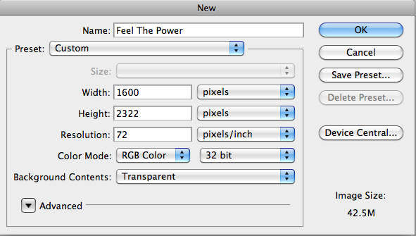
1 – Creating a New Image, and Setting Adobe Photoshop's Undo Option
Click File > New, and create a new image of any size you desire.
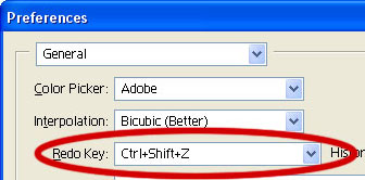
Press Ctrl+K to bring up the Preferences window.
Change your "Redo Key" to Ctrl+Shift+Z. This enables you to press Ctrl+Z at any time, to undo the last thing(s) you did. Remember this.
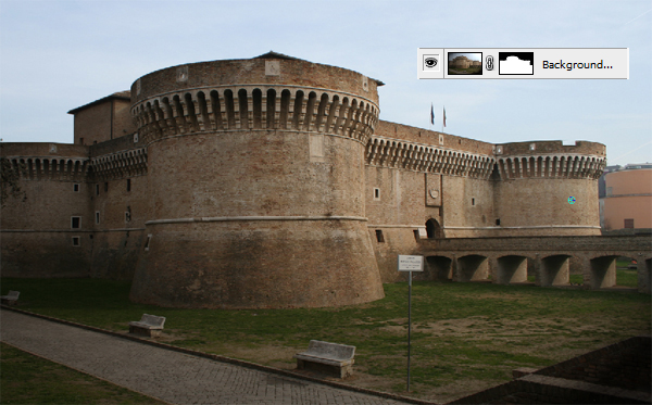
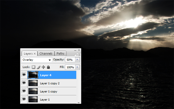
2 – Using Adobe Photoshop's Layers window
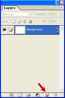
The Layers window shows the various layers that your image is made up of.
To make a new layer, click the New Layer button, as shown by the red arrow.
To work on a different layer, click on that layer. The eyeball will apear next to that layer.
You can drag layers up and down the list.
Remember – create a new layer for each part of your image. This allows you to go back and edit the layers individually. Every Adobe Photoshop beginner at some time makes a masterpiece, only to find out that they did it all on one layer, and now they can't remove those pink clouds they put on it.
")
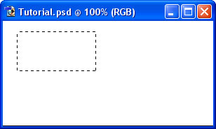
3 – Learning about Selection
One of the most important concepts in Adobe Photoshop is Selection.

Use this tool on your image to select an area of the image. This lets Photoshop know that that's the area you want to work on.
4 – Adding to a Selection and making a square
To add to a selection, hold Shift before dragging.
Tomake the selection exactly square, start dragging, then hold Shift.
You can press Ctrl+D to "deselect" and remove the selection at any time.
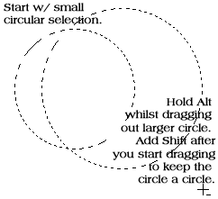
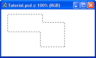
5 – Elliptical Selections and subtracting Selections

To move the selection, just click inside it and drag.
Holding Alt while selecting subtracts that area from the selection. I've done that with the Ellipse Selection Tool.
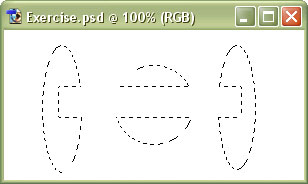
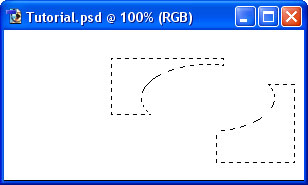
6 – A Selection exercise
If you're following this tutorial in Adobe Photoshop, see if you can make these shapes.
Other relevant Adobe Photoshop tools


7 – Choosing a colour
Now that you know how to select an area in Adobe Photoshop, we can look at some tools that can do something with that area.
Before we get started on colouring your selection, you'll need to pick a colour.
This part of the Toolbox is where you select your colours.
The top square is the foreground colour. If you use a brush or paint bucket, it will apply this colour.
The bottom square is the background colour. It has various purposes, but it's also a good place to store a second colour that you're using.
Click on either square to change its colour.
Click the arrow to swap the two colours.
Click the little squares to reset the colours to black and white.

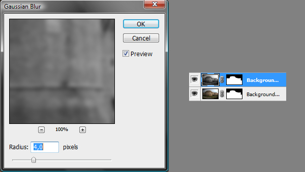
8 – The Paint Bucket and Gradient tools
These two tools share a button on the toolbar. To select one, click and hold.

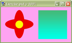
9 – A colour exercise
With what you've learned so far, you should be able to recreate this piece of hippy history.
Remember to create each step on a new layer.
Other Adobe Photoshop tools of interest include


eto yung ilan sa mga gawa ko

HOPE YOU LIKE IT FEEDBACK NA LANG PO
List of tutorials
Page 1
The Incredible Pen Tool
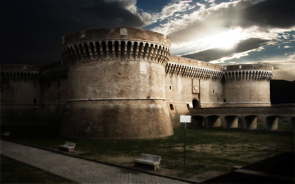
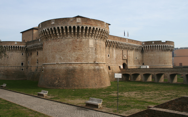
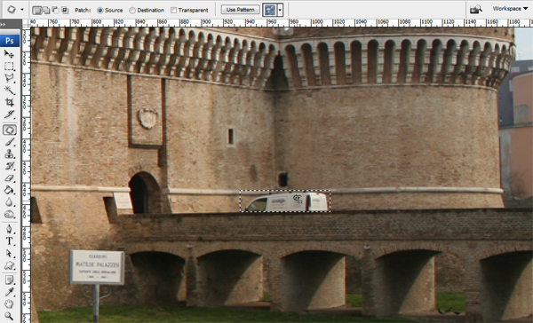
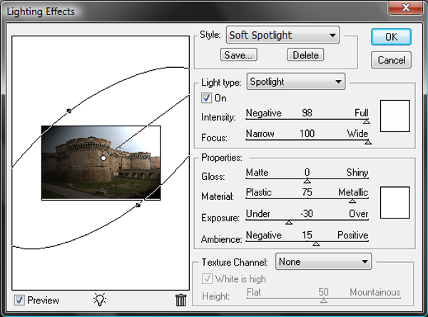
Add Dynamic Lighting to a Flat Photograph
Add Dynamic Lighting to a Flat Photograph
Page 2
TIPS AND TRICKS USING PENTOOL
Familiarizing Yourself with the Photoshop Interface
Using Tools from Photoshop's Toolbar
Familiarizing Yourself with the Photoshop Interface
Using Tools from Photoshop's Toolbar
Page 3
Turn Your Own Car Into a Customized Street Racer
How to Turn Humdrum Photos Into Cinematic Portraits
How to Turn Humdrum Photos Into Cinematic Portraits
Page 7
Minimize, colorize and bodypaint a Supercar
Page 9
Create a Dark, Conceptual Photo Manipulation With Stock Photography
Page 11
ghost effect tutorial
Page 14
Photoshop Compositing Secrets: Create a Studio Sports Portrait
Page 20
Create a Graffiti-Inspired Illustration Using Photoshop and Illustrator
Page 21
Quick Tip: Create a “Transfarmers” Text Effect Using Layer Styles in Photoshop
Faded Pixels Photo Border Effect In Photoshop
Faded Pixels Photo Border Effect In Photoshop
Page 22
Shape Cluster Photo Display Effect
Page 23
Lightning Effect In Photoshop
blending layers
blending layers
Page 24
Create a big barrier shield
Page 25
Create image to text Part 1
Create image to text PART 2
Create image to text PART 2
Page 26
Create a Phone background wallpaper
Di ko alam yung title ng tutorials ni Sir Critical dave
Di ko alam yung title ng tutorials ni Sir Critical dave
Page 27
Tutorial by sir criticalgrave PART 1
Tutorial by sir criticalgrave PART 2
Tutorial by sir criticalgrave PART 2
Page 29
Quick Tip: How to Create an Abstract Wireframe Text Effect
Page 31
Tutorial by Sir CirticalGrave
Page 32
Tutorial by Sir CriticalGrave
Page 34
Quick Tip: How to Smooth Skin Without Losing Texture in Photoshop
NEW UPDATE
NEW UPDATE
Page 39
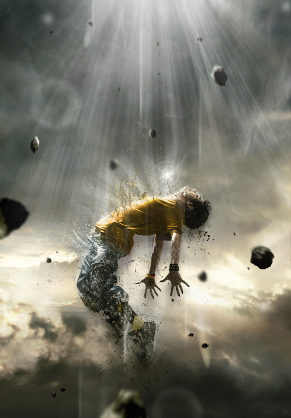
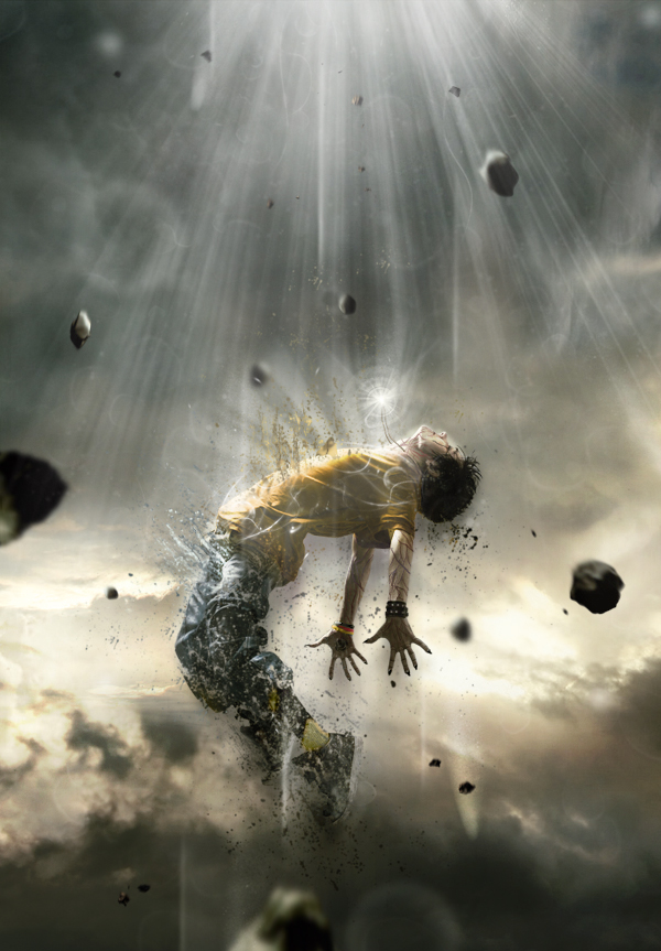
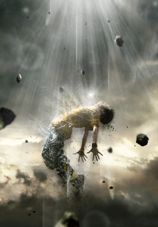
Dynamic portrait na may flashy lights by Sir Criticalgarve
NEW UPDATE
NEW UPDATE
Page 41
Create a Grungy Skateboard Photo Montage Poster
By: Pandasauure
New Update
Page 44
Quick Tip: Remove a Person From a Photo With Photoshop CS5’s Content Aware Feature
Last edited:
 ts keep sharing.!


 ...thanks po TS...

 yup bonus lang po yan sir yung nasa taas lang po yung pang beginner.. mag update na alng po ako nxt time ng pag beginner na tutorials gagwa muna ako ng homework ko kelangan na kc bukas eh
  Pag Free ako...