- Messages
- 2,784
- Reaction score
- 96
- Points
- 198
Most of our features and services are available only to members, so we encourage you to login or register a new account. Registration is free, fast and simple. You only need to provide a valid email. Being a member you'll gain access to all member forums and features, post a message to ask question or provide answer, and share or find resources related to mobile phones, tablets, computers, game consoles, and multimedia.
All that and more, so what are you waiting for, click the register button and join us now! Ito ang website na ginawa ng pinoy para sa pinoy!
thanks sir LJ noted po, san ba makita yan eye toning? nyehehe pasensya na noob lang po sa ganito.
kua mael pa comment lang po
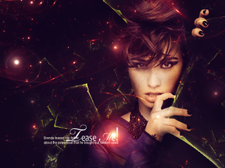
Yun unang tag po yun trip ko
- para sa aking kulang sa sharpen
- medyo dull yun kulang ng focal
- yun buhok at mukha overblended, nawawala yun details ng buhok at appeal ng mukha po
- gusto ko yun effects, ayos naman yun mga palilaw mu po
- konting face enhance pa siguro, gaya ng EYE TONING para ma-standout yun focal kesa sa BG
- overall po 7/10

 anong software gamit niyo? salamat


ang gagaling naman ng pagkaka gawa
")

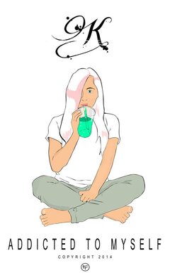
My first photo manipulation, im still learning so dont be harsh
View attachment 977506
View attachment 977505


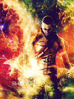
 kumbaga somewhere out there parang may light source na tumatama sa likod nung puno. tapos i-burn tool mo na lang siguro yung ibang element (like yung puno & its' branches) para dumilim.
 siguro, try mong i-dodge tool yung ibang parts (preferably siguro yung harap na parte since yung closest light source eh nasa harapan) niya or maglagay ka ng layer na naka-clipping mask (overlay? soft light? diskarte mo na yan) sa layer nung baby then brush tool na white ang foreground color para masabing may light source na tumatama sa kanya. para mas convincing/realistic si baby.
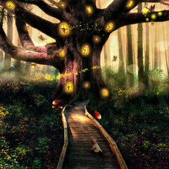
Long time no see mga ka-symb..
Eto muna share lang
http://fc09.deviantart.net/fs70/i/2014/187/2/8/dinosaur_world_doodle_by_yami_joey-d7pgc4a.jpg

boss paturo ako kahit ano gusto ko pagalaw ng image..

Gawa ko po ulit. Naboring walang internet HAHAHA
Nahihirapan talaga ko sa damit
View attachment 979266
imbis na maglaro parang mas masarap na gumawa na lang ng artwork hehe. photoshop?


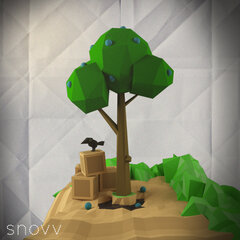
View attachment 989132
pa CnC po nito for my bnew asset for the games i will be made. marami po naging reference nito since mahilig ako sa minimalist or low-poly art design.
salamat.
ganda!